OECD
The project
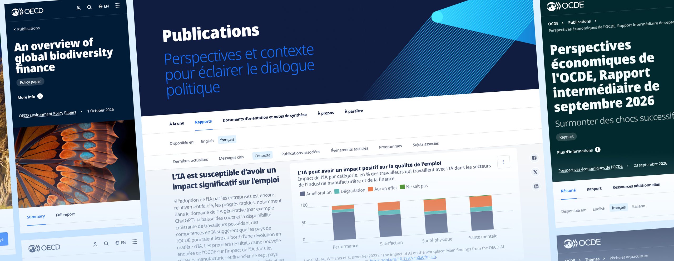
The new website of the Organisation for Economic Co-operation and Development (OECD) went live in 2024 with 4 header components where the designs had 14 variants. I joined its design phase to guarantee a smooth implementation. With a junior designer I coached, I owned the component library end to end, from creating it to documenting and communicating it. For complex patterns, like the secondary navigation and the content language picker, I built interactive prototypes to validate them with stakeholders.
The website runs on Adobe Experience Manager (AEM) as a Cloud Service and is built on its Core Components. It makes the data of 45 countries available in multiple languages and supports dozens of subsites. Every component had to be built in AEM and work with representative translated content.

Context and team
The OECD and its subsidiaries lacked a consistent visual identity online. The new website serves mostly policy makers. Content authors build its pages in AEM. An external lead designer created the visual direction and the desktop and mobile designs. I aligned with that designer, designed the tablet breakpoint and co-presented proposals in frequent feedback sessions with around ten key stakeholders. Together with a functional analyst colleague and our technical lead, I made sure every design could be built in AEM and estimated the front-end work.
From 14 headers to 4
The lead designer created 14 header variants, very different and great-looking, including themed ones. Building each of them as a separate component would have made the implementation slow and hard to maintain.
With the same two colleagues, I brought them down to 4 header components, named Generic, Event, Article and Report. Generic has properties for breakpoint, image and theme. The other three only have one for breakpoint. The structure became unified, while the different styling stayed.
I kept the variation in the headers on purpose. They're above the fold and the most visible sign of the new design direction, so that's where expressiveness mattered most. That took considerable design and development time.
What the lead designer and I gave up was animation. A waving flag for each of the 45 countries wasn't feasible, but I built a prototype first, so cutting it was an informed decision. Letting authors inject HTML or JavaScript wasn't safe. As the implementers, the agency team made that call. The result was fewer components to build and easier maintenance, with room for expression across a large site.

Designing with representative content
Stress-testing with translated content showed where components broke. Breadcrumbs overlapped the header. Long titles and author-chosen images didn't always fit headers and banners.
I designed the text truncation and image clipping strategy for every UI element, from headers and banners to buttons and cards. Breadcrumbs that run out of room end in an ellipsis. Text over images got a gradient or overlay, a minimum contrast for the image area, a layout that moves the text off the image on small screens and rules for authors about which images to use.
Some content isn't fully visible at first sight, text and images don't always align perfectly and some components grow beyond their ideal size. In return, the components hold up with whatever language or image an author picks.
A WCAG 2.2 AA audit in 2025 flagged my truncated cards and buttons, because enlarged text hides even more of them. I'd still make that choice, because the full text is one click away, on the page that opens.

Tokens without a token plugin
I built the library in parallel with the lead designer's screens, which had detached instances and inconsistent layer names and spacing, so I made the library consistent from the start. Figma didn't support tokens yet. I didn't want to impose a token plugin on the lead designer, who was comfortable with color and text styles. So I chose styles, which we mapped together to token names, the future CSS custom properties. Spacing stayed raw values in Figma. In Zeplin, I named those values as spacing tokens, so developers could inspect them.
Nothing synced the tokens with the code automatically, which was the usual way of working back then.
I documented constraints alongside the designs, so possible problems were solved before they reached development.

A separate space for review
The client was very hands-on during the design phase. Figma's Dev Mode was still in its infancy. Developers weren't expected to work from Figma. I didn't want the client dropping comments across ever-evolving Figma pages.
I pushed for Zeplin, as I had on Wikifin, to give screens a separate space where they could be discussed and validated, with a version history. Instead of being overwhelmed by an infinite canvas, stakeholders looked at individual screens, grouped logically, with live URLs and links to Confluence and Jira alongside them, in an intuitive interface. The agency was already paying for Zeplin, whose licenses were cheaper than Figma's.
Keeping the screens in sync was on me, usually right before a client meeting. Meanwhile, the client kept asking why they couldn't use Figma. The agency team held the line. In my experience, the review rounds got calmer and clearer. The version history helped too.

The result
Based on the Figma designs (89 responsive screens) and the component library (46 patterns), the project team of around 20 people delivered an entirely new AEM website.
The redesigned site became the home of the OECD's move to open access. All its data and publications are freely available there, including the content of the former OECD iLibrary and a catalogue of almost 30,000 items from the OECD archives.
My part shows in the details. A WCAG 2.2 AA audit in 2025 found no missing focus states, which I'd added beyond the specs.
The website and its subsites give the OECD and its subsidiaries a consistent visual identity, aligned with their other communication channels, to make them easier to recognize online.

The kitchen and the dinner table
I still believe a design team needs a kitchen to cook in and a dinner table to serve the food. Today, both look very different. The kitchen isn't only a design tool any more. What's served at the dinner table looks more and more like a tangible version of the end product. In my projects today, the design decisions live either in code or in design tools. One of the two is always the driver.
The specs only asked for alt text, so I added focus states and aimed for WCAG AA. The 2025 audit did find contrast issues. Several came from the build, like an opacity added to my subtitle color. Others were mine. If I designed this library again, I'd check contrast beyond body text. Secondary greys, icons and borderless fields looked fine, but some fell short of the 3:1 or 4.5:1 they need. I'd also give every field a visible label, because a placeholder or a selected value disappears as soon as someone uses it.
I see the project as a success. It taught me how to navigate collaboration across companies, knowing when to push back on the lead designer's choices and when to trust their call and the client's approval.
It was also my first chance, as a design engineer, to structure Figma files on a project of this size the way I'd wanted them when I worked on others as a developer. The front-end team got that structure through Zeplin.