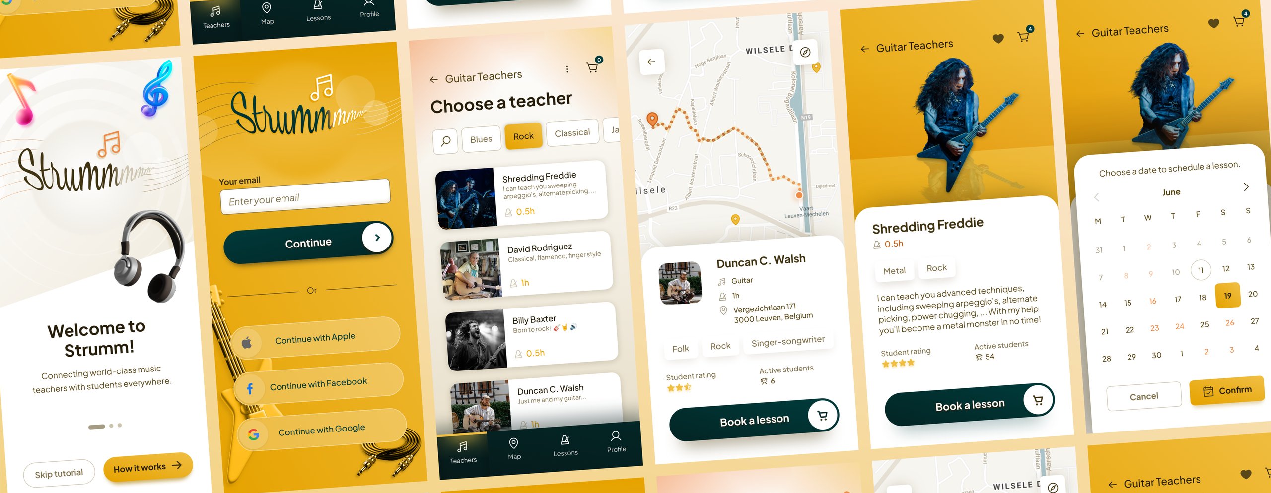
Strumm
The project
Strumm is a mobile app I designed on my own in 2026, in the course Mobile App UI Design 2: High Fidelity. It builds on mockups I made in 2021 for the course Mobile App UI Design 1, which earned me a certification. Only submissions scoring 95% or higher qualified.
The goal was to sharpen my UI design skills, so I went straight to execution and skipped research. That makes these screens a hypothesis. They show how I'd solve the problem, but they haven't been validated with users yet.

What the critique changed
The 2021 assignment was to invent a digital product, design screens that express its user flows and master fundamental UI design principles like spacing, typography and visual hierarchy. I delivered a set of mid-to-high-fidelity mockups, which the course's instructor, Michal Malewicz, personally critiqued.
His feedback shaped the high-fidelity screens I designed later:
- The login button got stronger contrast.
- Teacher cards use fewer text sizes and drop the word "per". The whole card is now tappable, so it no longer needs a separate button.
- Times are picked from a single scrollable list instead of two columns, which he found hard to scan on mobile.

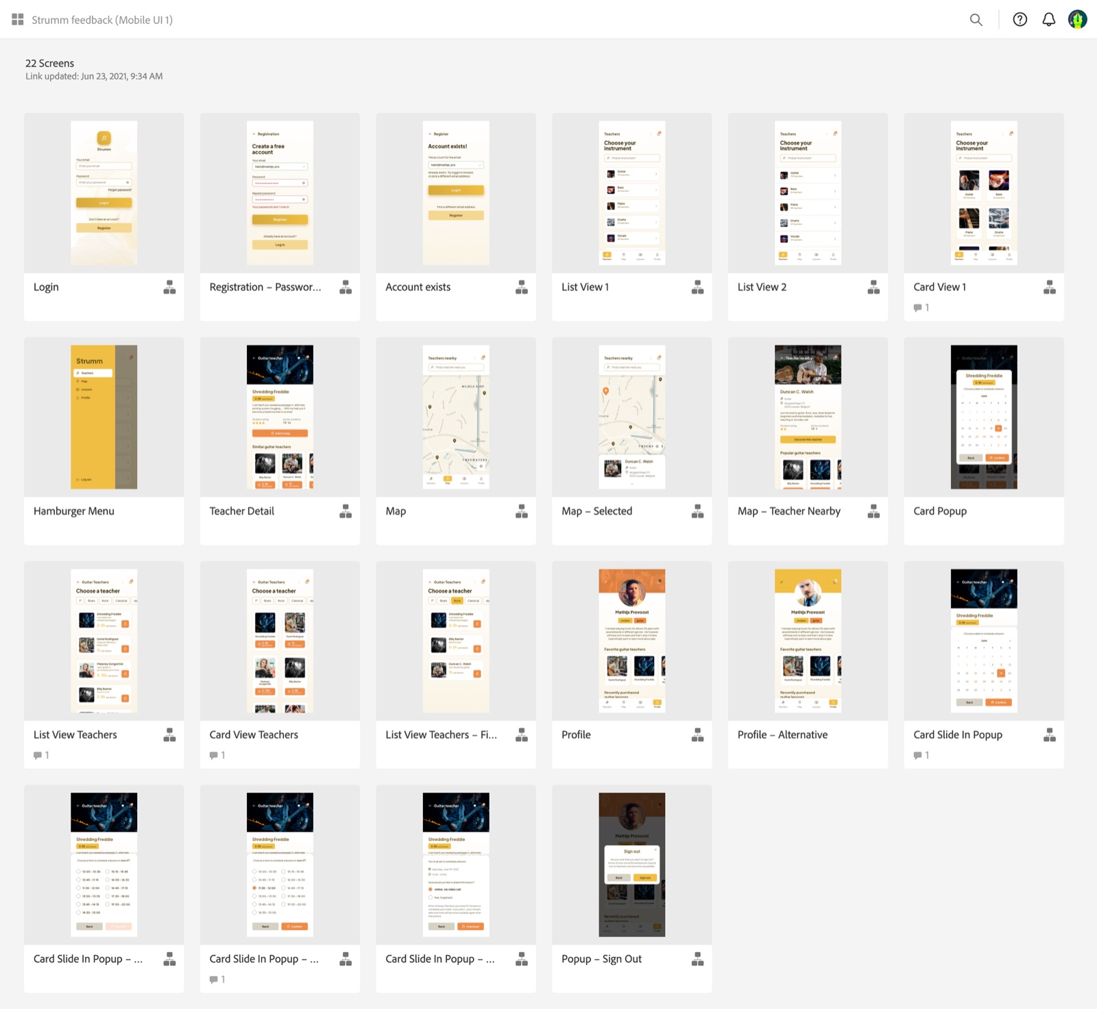
The 2021 mockups in Adobe XD that Michal Malewicz critiqued 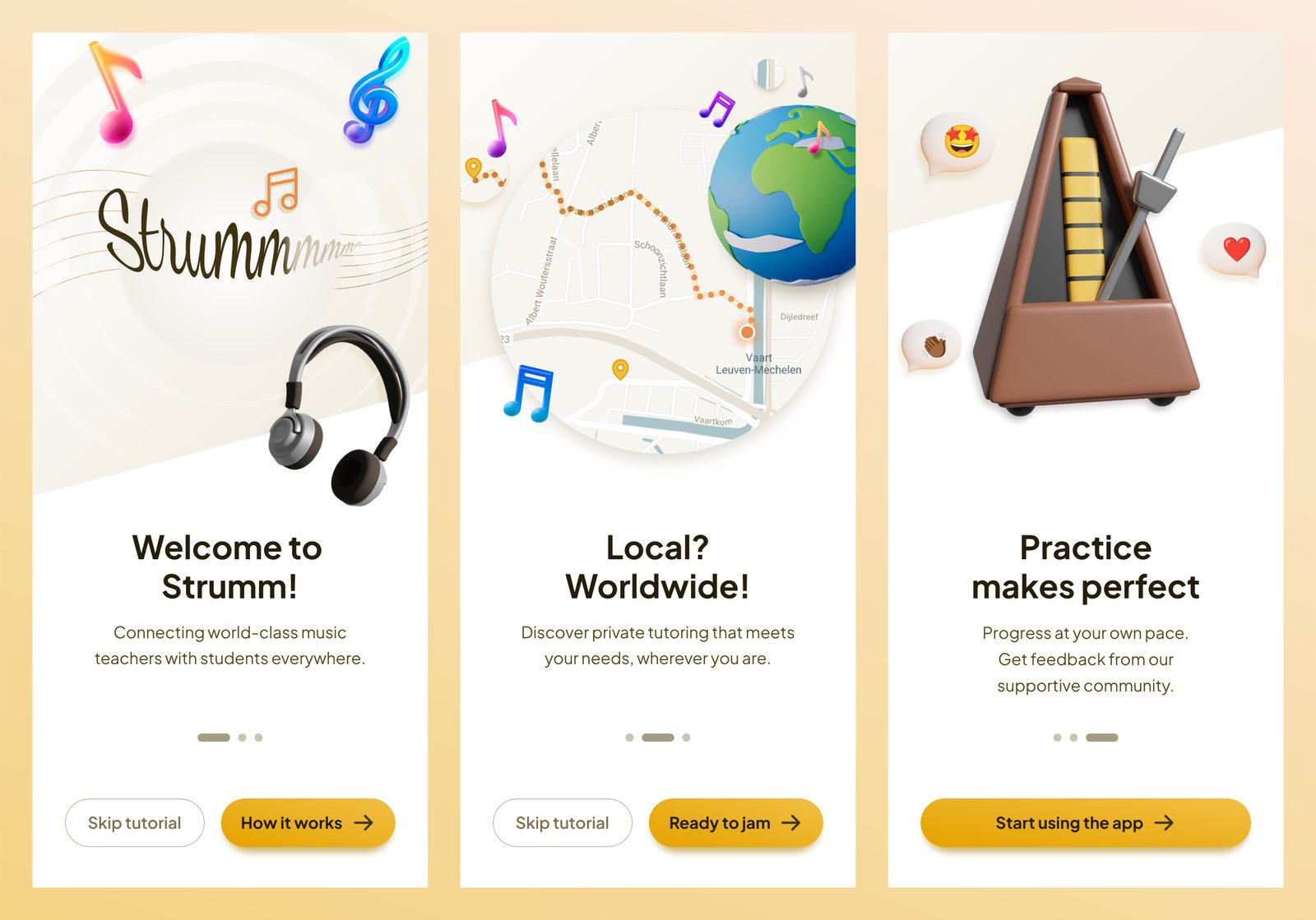
The 2026 onboarding screens


Welcoming, but readable
I wanted Strumm to feel warm and friendly without losing readability. Yellow sets that tone.
The contrasting color started as brown, to match the yellow more closely, but it blended too much into the background. Switching to dark teal (cyprus) traded that close match for strong contrast. Both colors stay recognizable for people with a color vision deficiency.
The typeface, Plus Jakarta Sans, puts readability first. Its rounded shapes feel as warm as the yellow. Every tap target is at least 44 by 44 points. All text meets WCAG's AA contrast level.
The 3D illustrations aren't mine. They're images by Magnific. The photos come from Unsplash and Pexels.

Two ways to find a teacher
Students can find a teacher in a list or on a map. The course brief asked for both. I agree they make sense for this product. Personally, I'd lean on the list as the main way in, because it shows a lot more useful information at once about the music lessons students are looking for. That makes the map the second way in, for students who think in distance first. The list also includes every teacher, in a form that works with a screen reader, so the map is never the only way to find one.
The list starts from the instrument, showing how many teachers each one has. Then it narrows down by style. Every teacher profile shows a student rating, the number of active students and the styles they teach, so students can judge a teacher they've never met.
Every lesson has the same fixed price, but the teacher decides how long it lasts. That's why each teacher shows a lesson length instead of a price.

Privacy on the map
The map shows the teachers near you and the route to the one you select. Teachers stay in control of their visibility. A selected teacher's address only appears when the teacher allows it.
Not every teacher would want their address on a map. Privacy is important to me, so I added a banner that tells students how many teachers in the area prefer not to share their location but are available for online lessons. It also keeps the map from looking empty where few teachers show a pin.
But the banner takes up as much room as the search field and the navigation, which makes it another visual landmark competing for attention. That's why it would collapse into a smaller area as soon as you start using the map.

Booking in three steps
Booking a lesson takes three steps, from picking a date and a time to choosing whether to attend online or in person. Splitting them up keeps the cognitive load as low as possible. Each screen asks for one choice, with a clear way back to correct an earlier one. Three screens take more taps than one, which I accepted for the lower load. The calendar is largely unchanged from 2021. Michal's only comment on it was "Nice calendar!"
The time picker shows the time zone, which matters when teacher and student live in different countries. At checkout, Strumm holds the chosen slot for 10 minutes, so no one else can book it while you complete your order.
To test this flow, I'd run separate sessions for students and teachers. I'd start with 5 to 10 people from my network and extend the group with an online call for participants. Each session combines an interview with hands-on tasks in a prototype, while the participant thinks aloud.
With students, I'd watch where they hesitate. Can they book a slot without help, do they mistake the lesson length for a price and do they feel sure the lesson is booked? Teachers would tell me whether they'd share their address and what lesson length they'd set for the fixed price. Then I'd fix what goes wrong and test again.


If Strumm became real
This project was about free experimentation, so I kept componentization to a small set of icons, inputs, buttons, backgrounds, navigation, dividers and cards. Next time, I'd build the components more consistently, so the screens are easier to maintain and hand off.
As a musician myself, I'd love to turn Strumm into a real product. Unfortunately, that's not realistic considering the required time and resources.
The onboarding promises world-class music teachers for students everywhere, private tutoring wherever you are and feedback from a supportive community. Like the rest of the app, they're assumptions that need validating before building on them. How do students and teachers find each other today? Do students want to choose between local and online lessons? Would they use a community to get feedback on their progress? And what do parents, who often book for younger students, need to trust a teacher they've never met?
If it became a real project, I'd start by talking to teachers and students to find out whether there's a product-market fit. I'd then define a minimum viable product with them, prototype its journeys and test them in the sessions I described for booking, before handing them to the development team.
During the build, I'd take a supportive role as a design engineer, working alongside the developers on the visual implementation and making sure the build stays true to the design. After launch, I'd stay closely involved in user testing and continuous improvement.