Wikifin
The project
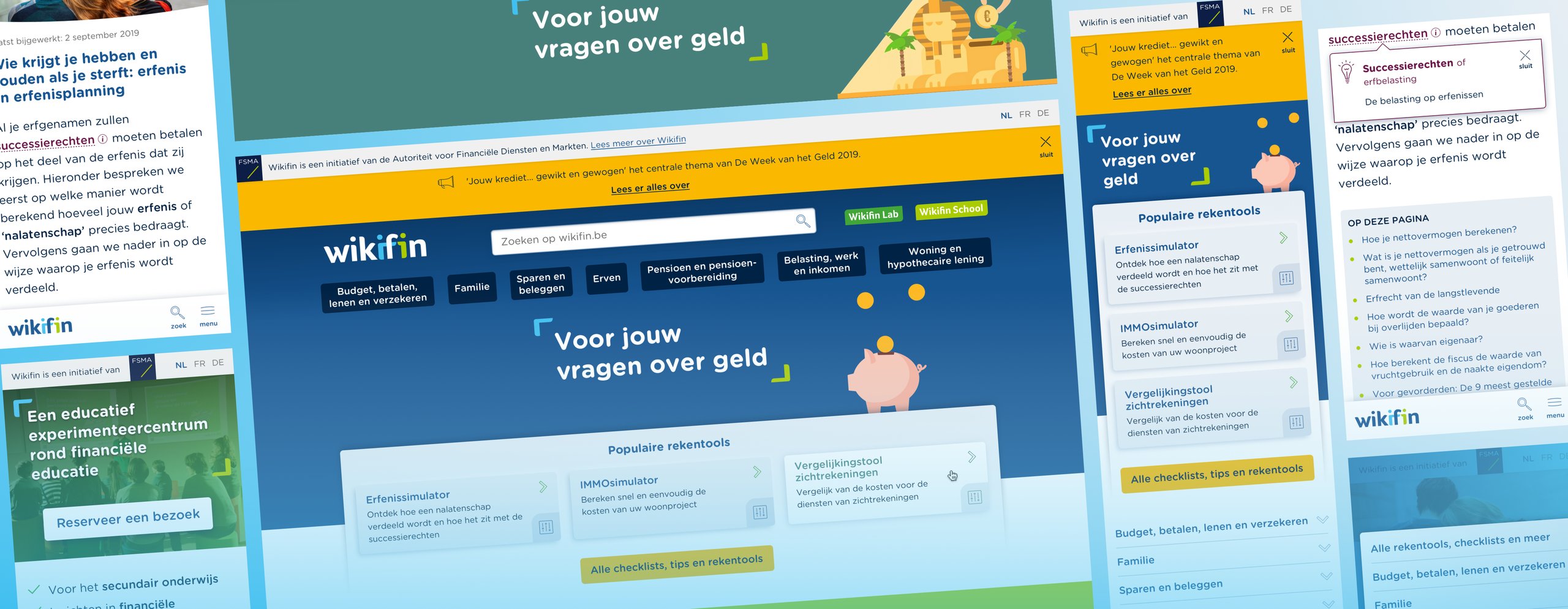
For Wikifin, the financial education program of the Financial Services and Markets Authority (FSMA), I designed a component library and 56 screens and then built the front end in Drupal myself.
The FSMA launched the redesigned website in June 2021, with a more modern look and feel, content in seven main themes and its own homepage for each part of the program. Those parts are Wikifin.be for the general public, Wikifin School for education and Wikifin Lab, the FSMA's financial education center in Brussels. The work had two constraints, a brand guide made for print and several layers of approval for every design.

Context and team
Wikifin offers independent, reliable and practical information on financial matters, in Dutch and French. Its website got more than four million visits a year. A UX agency delivered the wireframes. From July 2020 to spring 2021, I was the only designer in a team of five, with a project manager, a functional analyst and Drupal back-end developers. I designed the screens for desktop and mobile and built the Drupal theme. I steered the design process through frequent demos and feedback sessions with the stakeholders. Our contract also covered the FSMA's own website, fsma.be.
Blocks I'd build myself
The wireframes gave me the page structure, but no visual language or components. And they covered only the key pages. Most pages, like articles and deeper content pages, would be built by authors in Drupal, from blocks I'd design and then build.
I could design many one-off layouts or a few broad blocks. Knowing how I'd build them, I chose fewer, broader blocks that work in any order and combination. I built the library alongside the screens, so every demo showed full pages made from those blocks.
Authors can now make combinations I never designed. In return, they build new pages without design or development help. The blocks are still how the site's pages are built today.
Building also sent me back to the design. I'd only designed desktop and mobile. Real Drupal content broke layouts the Sketch screens hadn't. I fixed both in code, without updating Sketch. From then on, the theme was more complete than the design file. The design system's source of truth shifted from Zeplin to code, while Zeplin stayed the place where stakeholders signed off.

Where reviewing in Zeplin started
Every design went through several layers of approval at the FSMA, which made decisions slow. Feedback by email and PDF, or decisions made only in demo meetings, would have left no single record to work from.
I made validated screens in Zeplin the single place of sign-off. All approvers commented on the same screen. They reviewed between demos, so the meetings only settled open points. When a decision was reopened, there was a validated version to point back to.
Every demo needed the screens ready and in sync, which took preparation time. Stakeholders used Zeplin themselves, approved screens stayed approved and the FSMA kept working this way after launch, for fsma.be too. Keeping the working file apart from the review space became a principle I took to later projects, like the OECD website.

A print identity on screen
The FSMA's brand guide was made for print, with colors in CMYK and Pantone, a grid in millimeters and 13 colors with only one grey. It had no neutrals for backgrounds and borders, no tints or shades, too few colors for text and no background colors to give long pages rhythm.
I could stay strictly within the guide or extend it. I extended it with neutrals and with tints and shades. New background colors alternate between the sections of long content pages. I chose the new colors to complement the palette, not to derive from it. I showed them in full demo pages, so the brand owners judged them in context instead of as swatches. The brand identity's brackets and theme icons became part of an SVG symbol set.
Stretching the guide needed extra approval. More colors also meant more tokens to maintain and documented rules for which text color goes on which background. The brand owners approved it. Each part of the program is recognizable while clearly Wikifin.

Contrast without losing the brand
I held the design to WCAG AA, my own standard, but most of the brand colors were too light for text on white. Of the guide's 13 colors, only three had enough contrast.
For each color, I could darken it, accept low contrast or keep it for decoration and backgrounds. I gave every color a role, bright colors for decoration and backgrounds and dark ones for text. Then I checked every text and background pair. Where a brand color fell just short, like Warm Red and Off Green, I darkened it enough to pass. For text on green, I added a dark green. The FSMA accepted the darker colors easily. White text on Bright Green, the Wikifin Lab's own color, didn't pass. I flagged it in the design, but the Lab's brand color won. It shipped as it was.
This cost some brand fidelity. A few colors no longer match the guide exactly. The brightest ones are never used for text. Because I built the theme myself, I also added focus states and semantic markup and tested with the keyboard. The focus outline is Light Blue by default and Warm Yellow in overlays. On Wikifin School's green header, where Light Blue disappears, it's Deep Blue.

The result
Based on 56 Sketch screens for desktop and mobile, validated and delivered in Zeplin, our team of five delivered a brand-new bilingual Drupal website. The refreshed visual identity, aligned with the brand guide, gives Wikifin.be, Wikifin School and Wikifin Lab one family look.
The FSMA approved the final designs with few changes, kept us on for maintenance after launch and trusted us with their own website, fsma.be, next.
More than five years after launch, the website still mostly shows my design. Its CSS still uses my color tokens, named after the guide's colors.

Where design and code meet
My default focus outline, Light Blue, reaches only 2.10:1 on white. I didn't know yet that a focus outline needs 3:1 against its background, so I chose a color from the brand palette. Where it disappeared, I used a darker one.
I'd give the tool cards more contrast with the background. Their neumorphic styling was all the rage in 2021. I still think it looks good. The cards have enough affordance to be usable.
Not everything was in my hands. Contrast in the images and content that authors chose stayed outside my control. The styling of the cookie banner was cut.
Wikifin was a turning point for me. Because I built my own design, there was no handoff to lose things in. When the design and the build disagreed, I decided on the spot. It confirmed that I want to work where design and code meet, as a design engineer.